Telugu Typography in Print Media: A Designer's Guide
Designing for print presents unique challenges compared to digital design, and these challenges are magnified when dealing with a complex script like Telugu. From newspapers in Hyderabad to books printed in Vijayawada, professional Telugu print design relies on a specific set of rules, tools, and legacy workflows that every graphic designer working in the region needs to master.
This guide covers the core principles of Telugu print typography, helping designers bridge the gap between modern digital tools and traditional print requirements.
The Core Challenge: Vertical Metre in Telugu
In Latin scripts (like English), the primary typographic challenge is horizontal spacing (kerning and tracking). In Telugu, the primary challenge is vertical spacing.
A typical Telugu text line is inherently taller than English text of the same point size. This is because Telugu characters frequently utilize three distinct vertical zones:
- The Matra Zone (Top): Vowel markers like e-kara (ె), ee-kara (ే), and ai-kara (ై) extend above the base character.
- The Base Zone (Middle): The main body of the consonant (e.g., క, చ, త).
- The Vattu Zone (Bottom): Conjunct consonants (subjoined forms) attach below the base character (e.g., ్క, ్చ). Some vowels like u-kara (ు) and uu-kara (ూ) also occupy this space or attach to the side.
When setting body text for a book or magazine, designers must ensure sufficient leading (line spacing) so that the vattus of one line do not collide with the matras of the line below it.
Managing Leading and Tracking in Adobe InDesign
When working with Telugu text in professional layout software like Adobe InDesign or PageMaker:
- Avoid Auto Leading: Auto leading (usually 120% of the font size) is rarely sufficient for Telugu. If your text is 12pt, set explicit leading to at least 16pt or 18pt depending on the font.
- Justification Rules: Avoid full justification on narrow newspaper columns. Telugu long words do not hyphenate easily or gracefully. Left alignment is much cleaner and avoids the river-effect (large awkward gaps of white space between words).
- Tracking: Telugu characters should not be tightly tracked. The script relies on distinct circular forms; compressing them horizontally destroys readability. Stick to 0 tracking for body text.
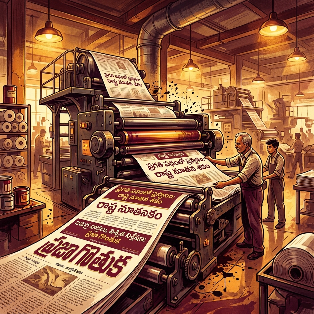
The Print Industry Standard: Legacy Fonts
While the web has fully embraced Unicode (like Noto Sans Telugu), the vast majority of the Telugu print media industry still relies on legacy encoding fonts — most notably the Anu Setup (Anufonts) series.
Why do print houses still use decades-old non-Unicode fonts?
- Print Optimization: Fonts like Priya, Priyanka, and Anu7 were specifically designed for high-density print. Their weight and spacing are optimized to be legible even on low-quality newsprint paper.
- Pre-Press Compatibility: Older hardware RIPs (Raster Image Processors) and print house workflows have established pipelines built around these specific font encodings.
- Typographic Control: Anu fonts often contain dozens of subtle ligatures and refined conjunct forms that some early Unicode fonts lacked.
The "Convert to Curves" Workflow
If you are a freelance designer sending final artwork to a commercial Telugu printer, the golden rule is: Never send live text.
Because there are multiple versions of Anu fonts (e.g., Anu6 vs Anu7) which map glyphs differently, sending an Illustrator or CorelDRAW file with live text almost guarantees that the printer will accidentally substitute a different version, leading to garbled matras (especially i-kara).
Always convert your Telugu text to paths/curves (Ctrl+Shift+O in Illustrator/InDesign, Ctrl+Q in CorelDRAW) before exporting the final PDF. This freezes the exact typographic shapes as vector artwork.
Choosing Fonts for Different Print Contexts
- Books and Novels: Use a serif-style font with moderate contrast. High contrast can cause thin strokes to vanish on absorbent paper.
- Newspaper Body Copy: Use robust, uniform-stroke fonts. The ink on newsprint spreads slightly (dot gain), so fonts need open counters (the negative space inside the circular loops) to avoid filling in and becoming dark blobs.
- Wedding Invitations: Calligraphic Telugu fonts are popular here. However, ensure that the elaborate swooshes do not impair the legibility of crucial details like names and dates.
Translate Unicode text to Print-Ready Format
Open Converter →